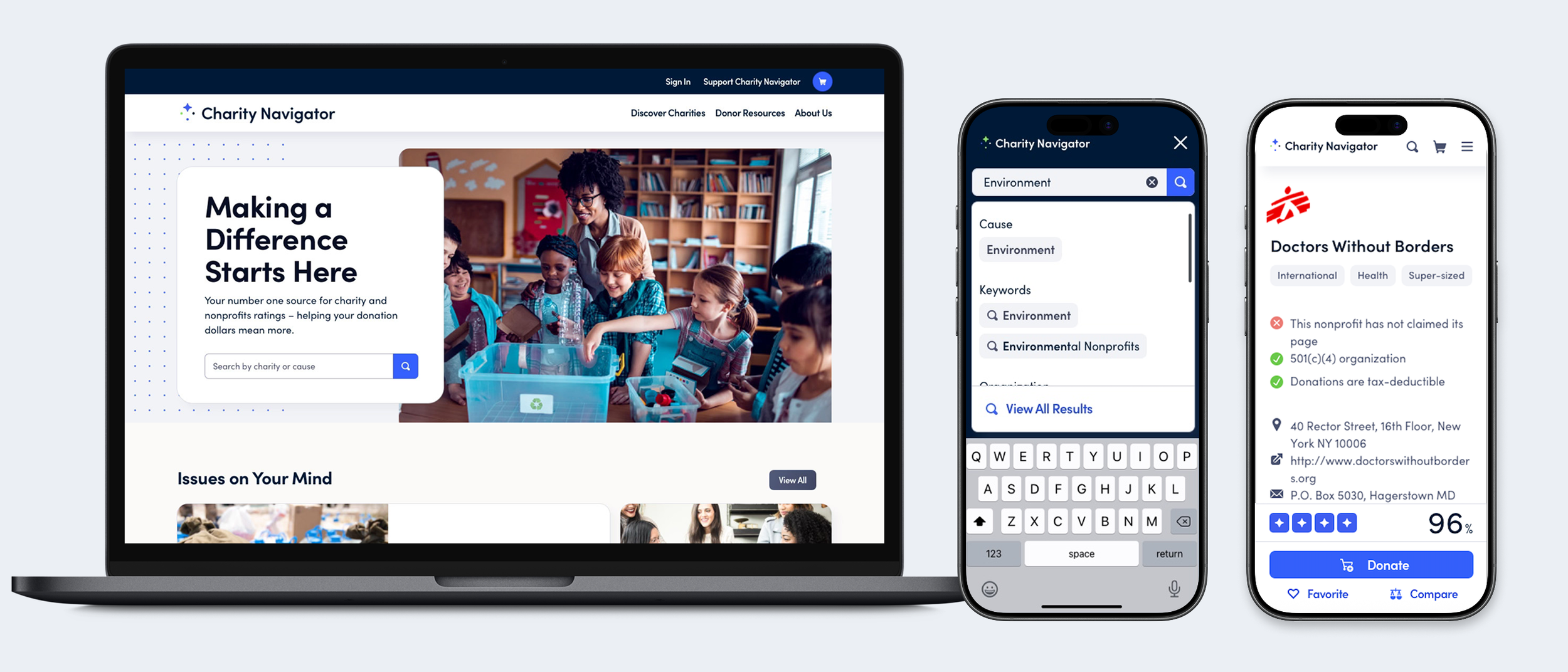
Screenshots of a charity organization website displayed on a laptop, a smartphone showing search results for environmental causes, and another smartphone with nonprofit information. The website features children gathering around a recycling bin with a headline about making a difference, and the mobile screens display search filters and details for nonprofit organizations.

Charity Navigator

OGILVY

LEAD DESIGNER

Charity Navigator is the world's largest, most trusted nonprofit evaluator. My team was tasked with redesigning their website for a new generation of donors. Our primary areas of focus to achieve an improved user experience were position a unified rating system, improve user log in and user account design, and design a search experience with a focus on discoverability and filtering. The design won an Anthem Award.

Design Workshop

〰️

User Research

〰️

User Journeys

〰️

Wireframes

〰️

UI Design

〰️

Prototype

〰️

Design System

〰️

Design Workshop 〰️ User Research 〰️ User Journeys 〰️ Wireframes 〰️ UI Design 〰️ Prototype 〰️ Design System 〰️

The Process


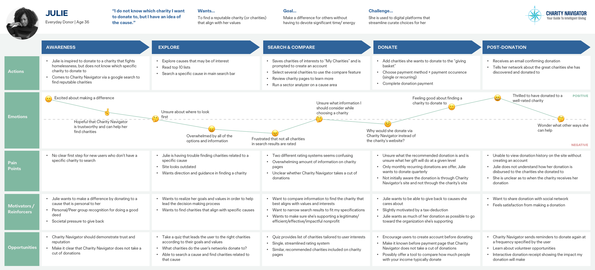
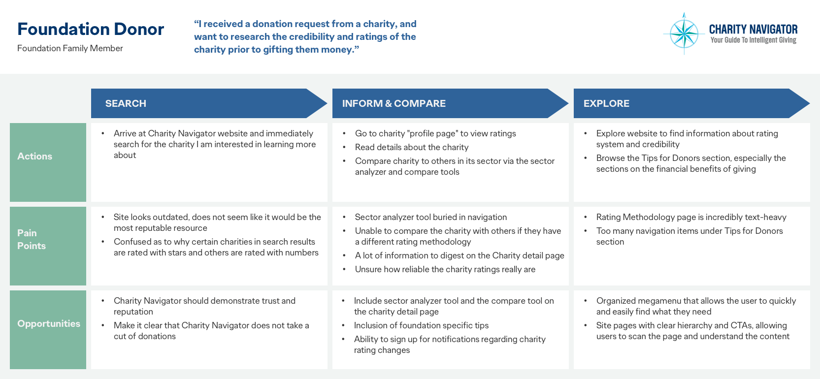
I facilitated a design workshop, to further understand our stakeholders’ mission, needs, and goals. We used this information to create personas for a wide range of donors, what their user journeys looked like and laid out their goals, pain points and motivators. We conducted a comprehensive content audit and completely restructured the information architecture.

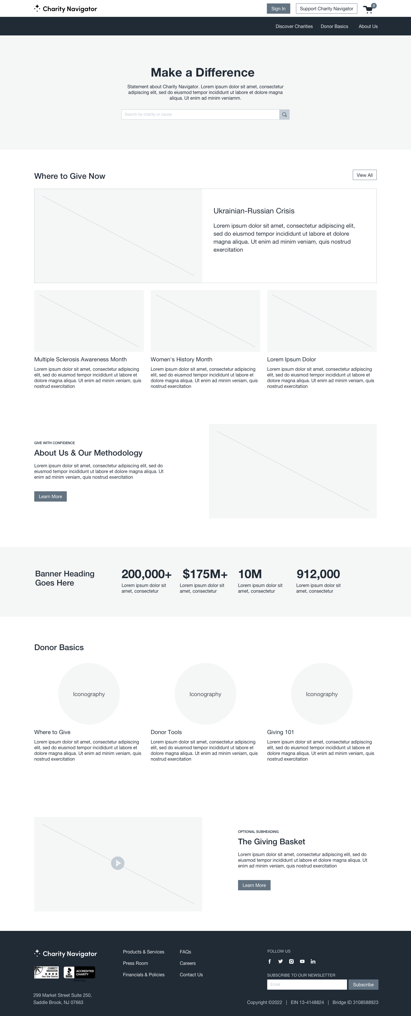
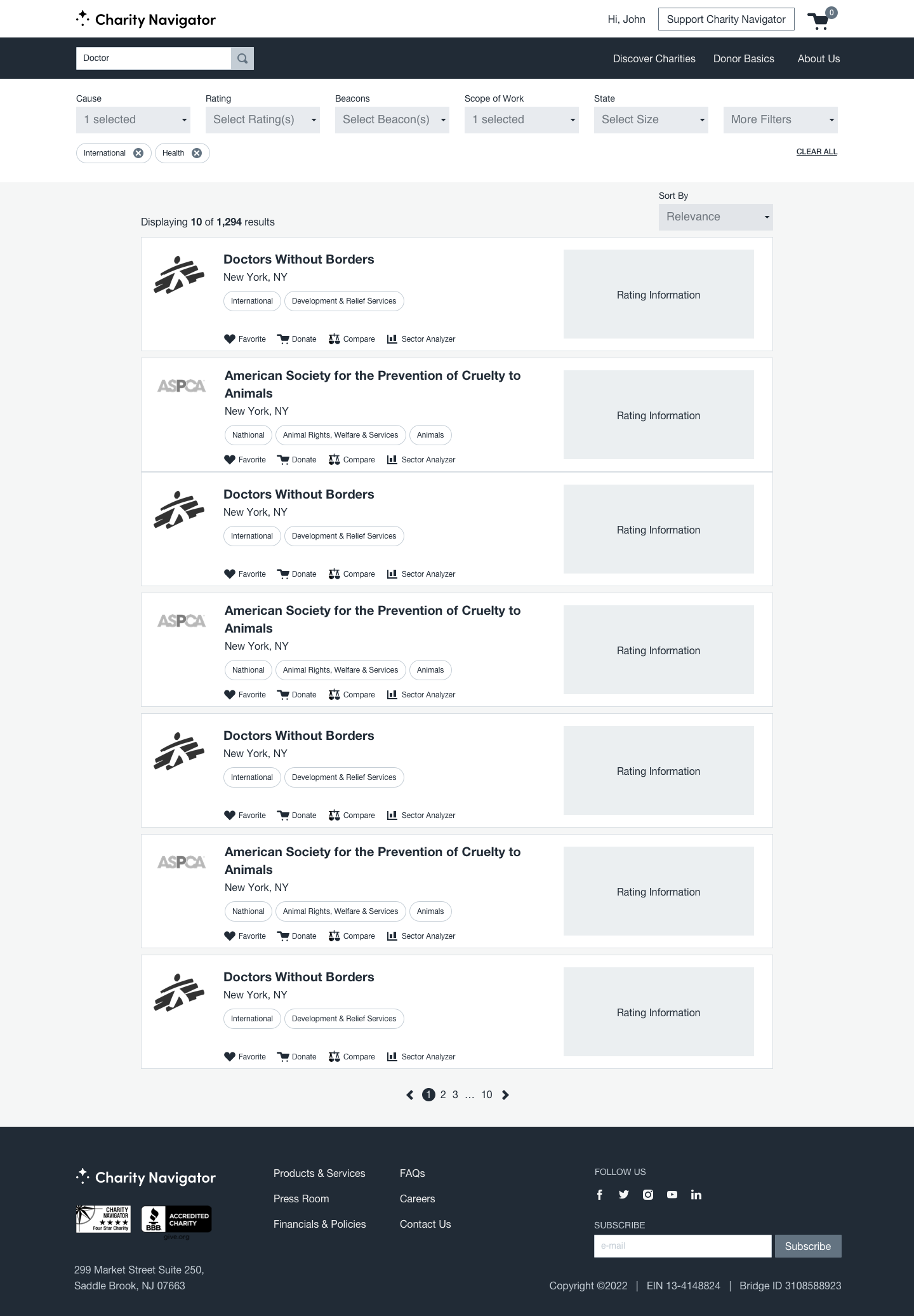
The workshop, personas, and new site map informed wire framing the search experience, charity profile pages, the charity rating system, homepage, page templates, user log in, registration, and account experience for the site. Special attention was paid to the updated search experience — presenting users with generative results by category, and offering robust filtering capabilities.
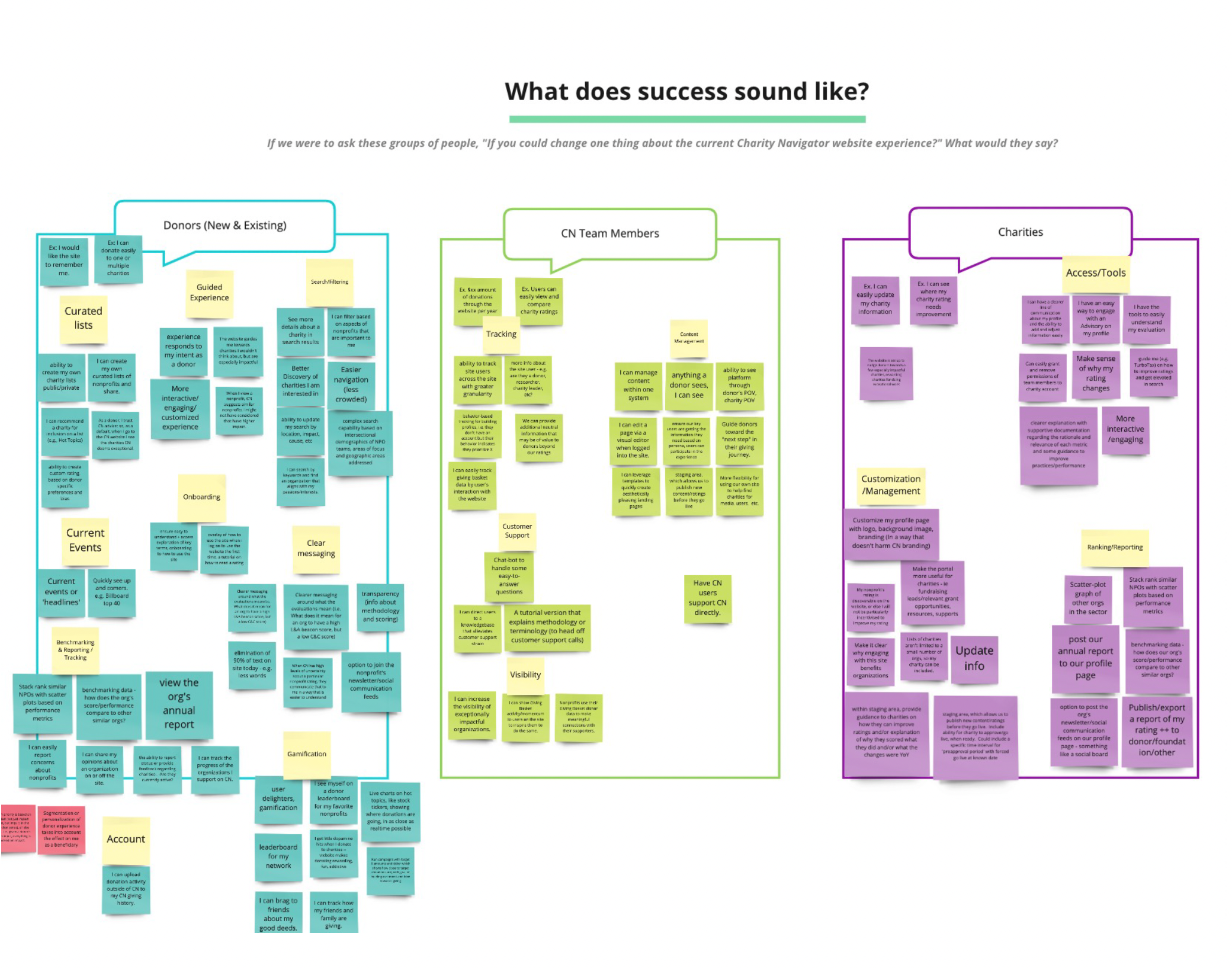
A colorful infographic with sticky notes organized into categories about success sound, including themes like donors, CN team members, charities, and account management.
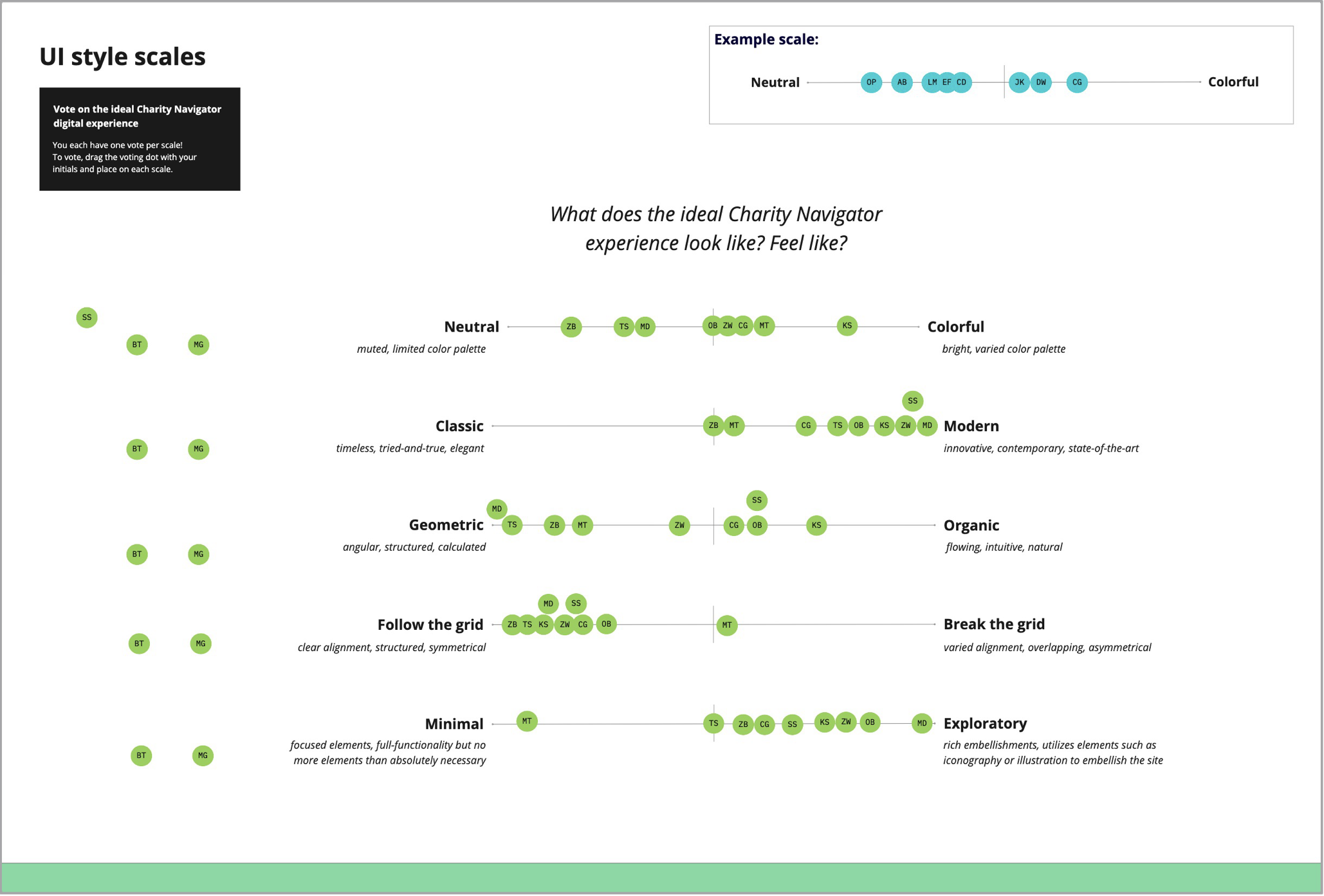
A chart displaying various UI style scales, categorized as Neutral, Classic, Geometric, Follow the grid, Minimal, with descriptions of each style's visual characteristics. The chart uses colored circles with initials to represent different design elements.
A detailed infographic about Julie, a 36-year-old everyday donor, and her experience using a charity search platform called Charity Navigator. It outlines her actions, emotions, pain points, motivators, reinforcers, opportunities, goals, challenges, and preferences in her charitable giving process.
Chart detailing steps to research and evaluate charities, divided into Search, Inform & Compare, and Explore phases, with actions, pain points, and opportunities listed for each phase.
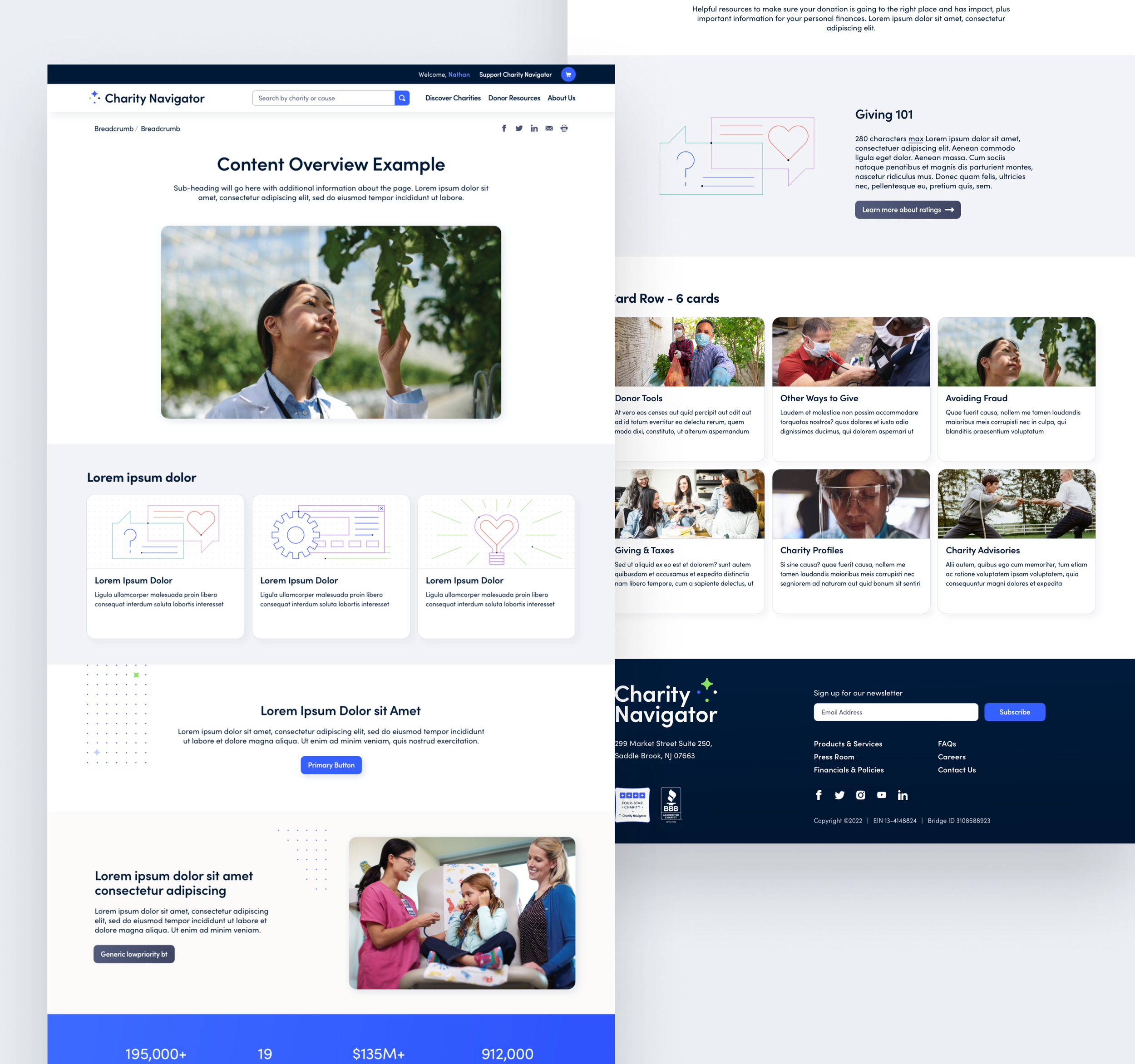
Charity Navigator website homepage with a 'Make a Difference' headline, search bar, sections on where to give now, about us, and donation basics, and a footer with contact info and social media links.
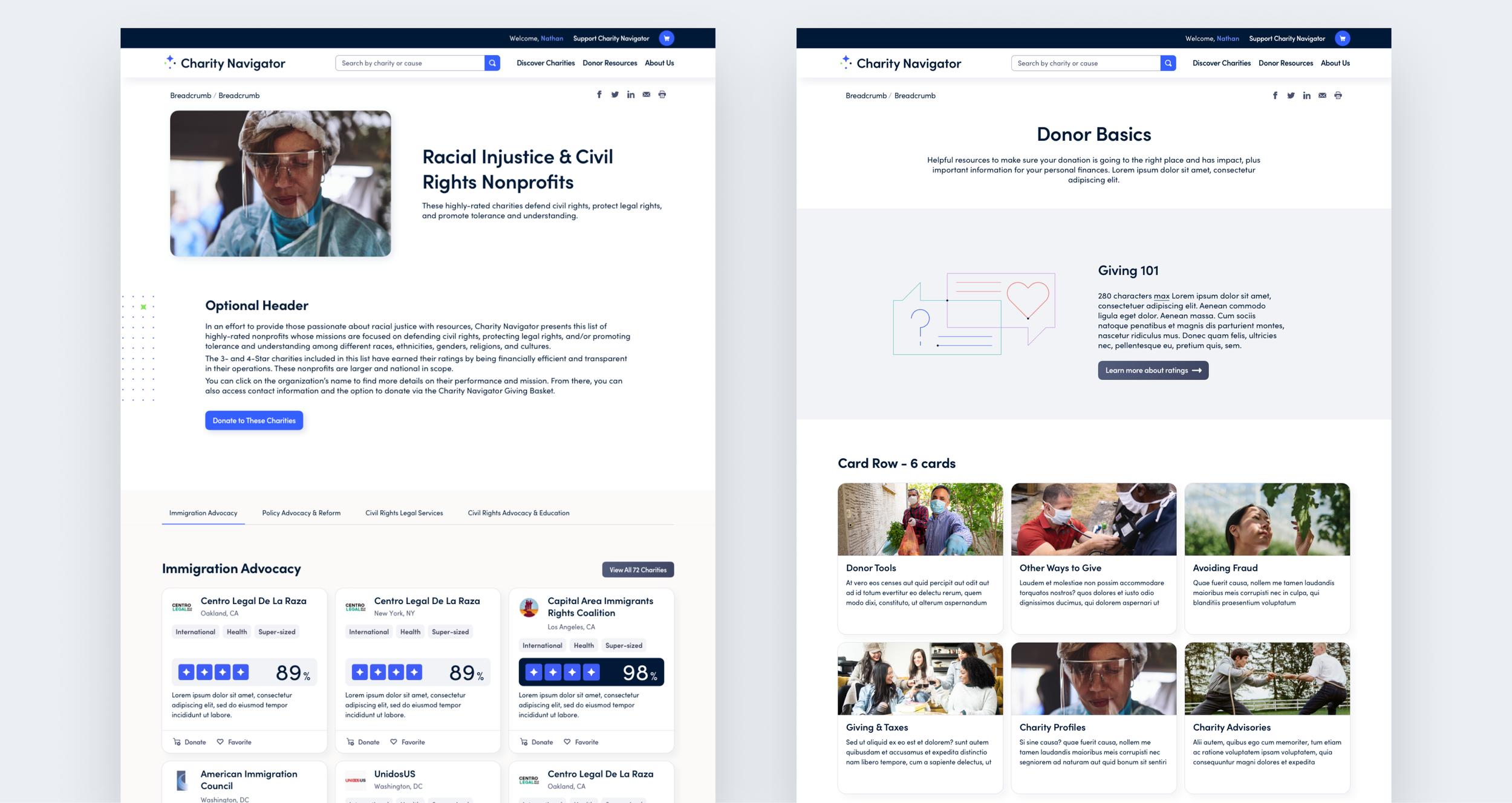
Screenshot of Charity Navigator's website showing a list of charitable organizations, including logos, names, locations, categories, and options to favorite, donate, compare, or analyze sectors.

The Results


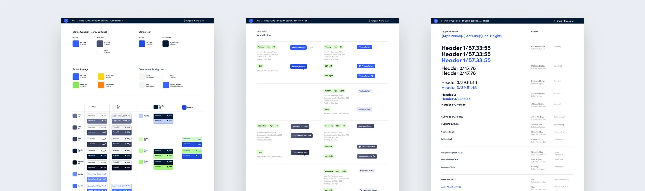
I redesigned the site with a modular, templated approach. We delivered high fidelity designs of the user log in, user account, homepage, search experience, charity profile pages, and other key pages, along with design templates by page type. I delivered a comprehensive design system and a corresponding style guide for the client to build the final product.

Since launch of the redesign, Charity Navigator has experienced a 142% conversion rate increase and a 218% increase in additional conversions. Through media stories, Charity Navigator has reached a potential audience of 77 million people. After the re-design, the site won a bronze Anthem Award in their non-profit campaign category.
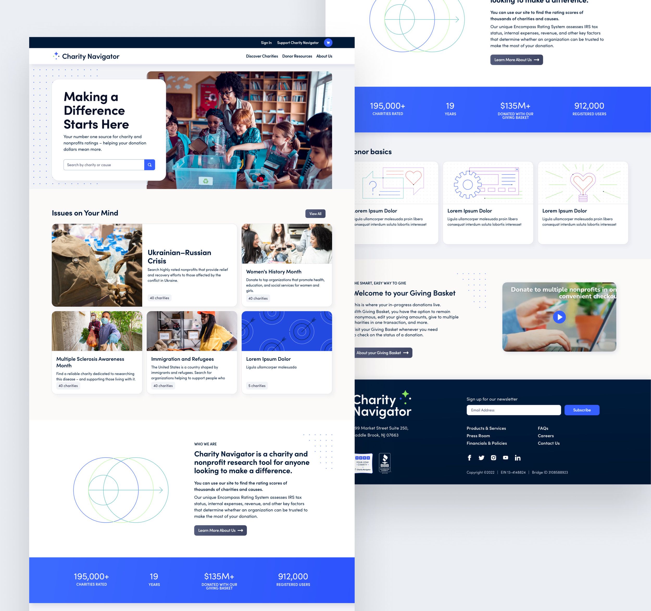
A computer screenshot of Charity Navigator's website displaying a homepage with a header menu, a large central image of children in a classroom, and various informational sections about charity ratings, issues, and donation statistics, with a blue and white color scheme.
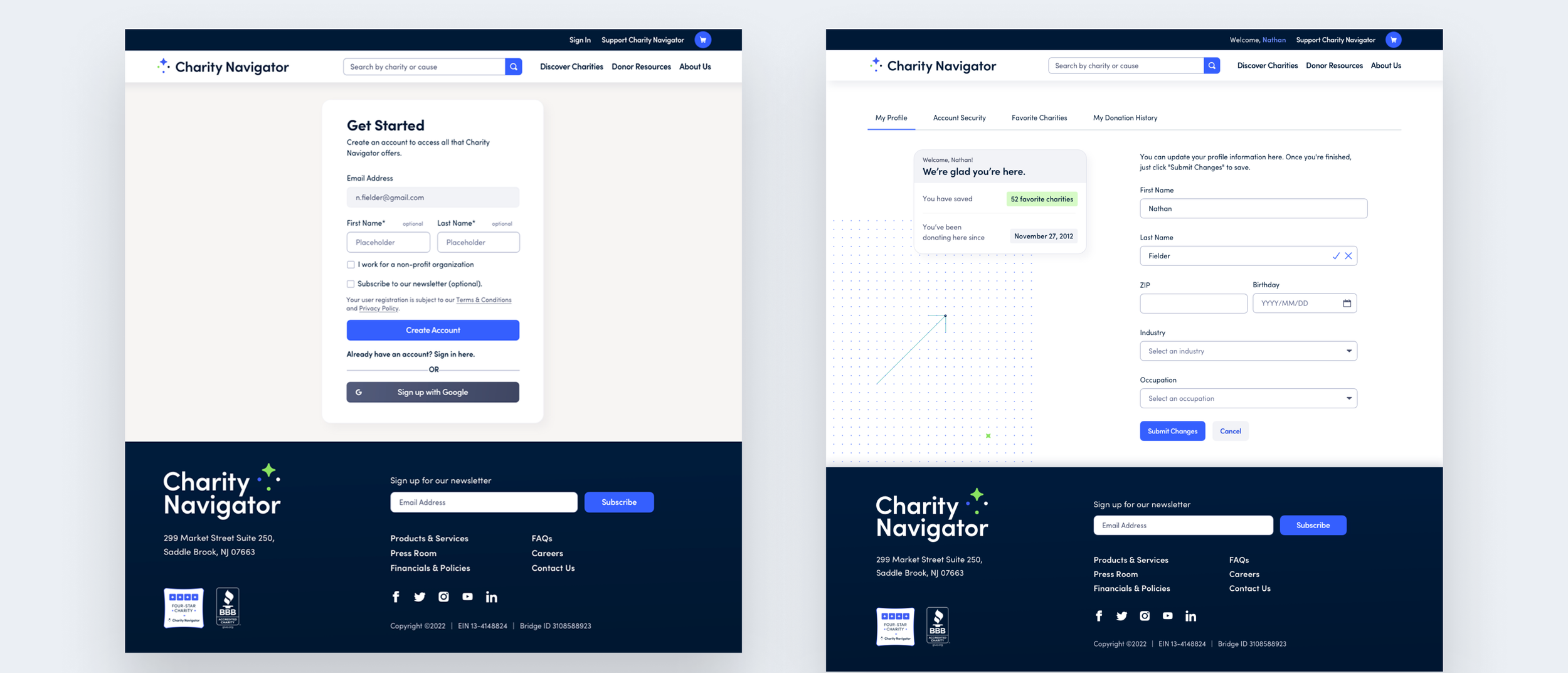
Screenshots of a charity donation website called Charity Navigator, showing user profile pages and account creation forms with fields for personal information, donation history, and charity preferences.
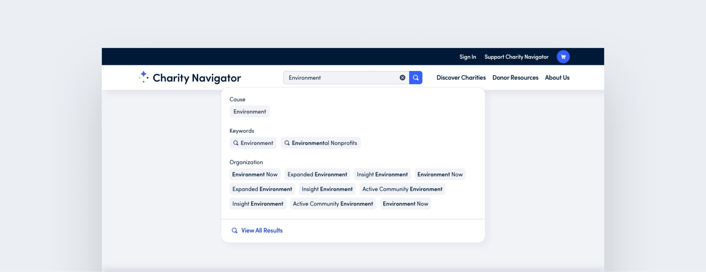
Screenshot of Charity Navigator webpage with search results for 'Environment' cause, showing related keywords and organization options.
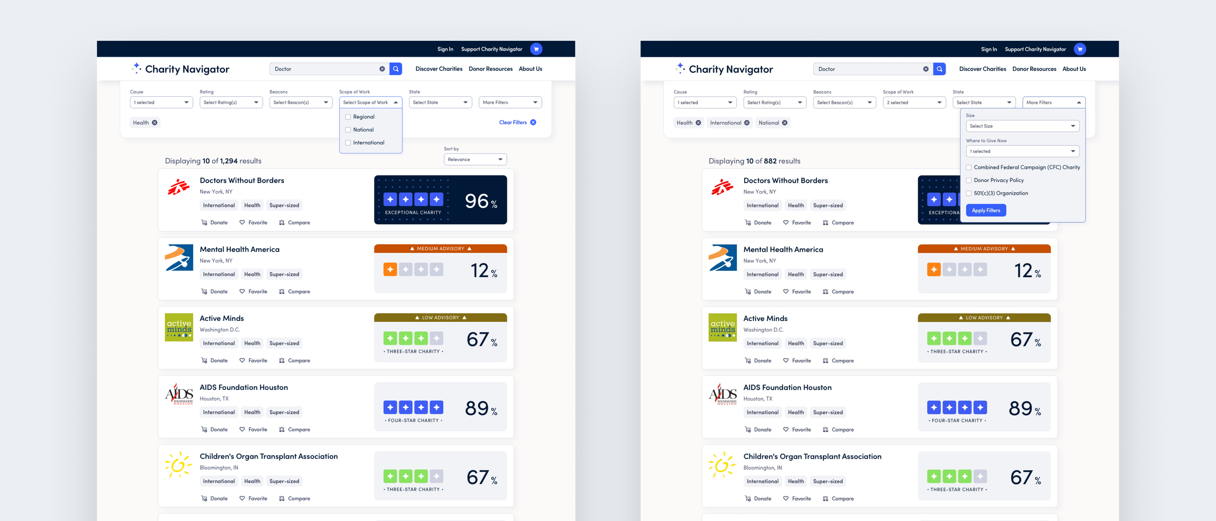
Screenshot of a charity charity navigator website with filters and search options, showing a list of charities with their ratings, categories, locations, and donation buttons.
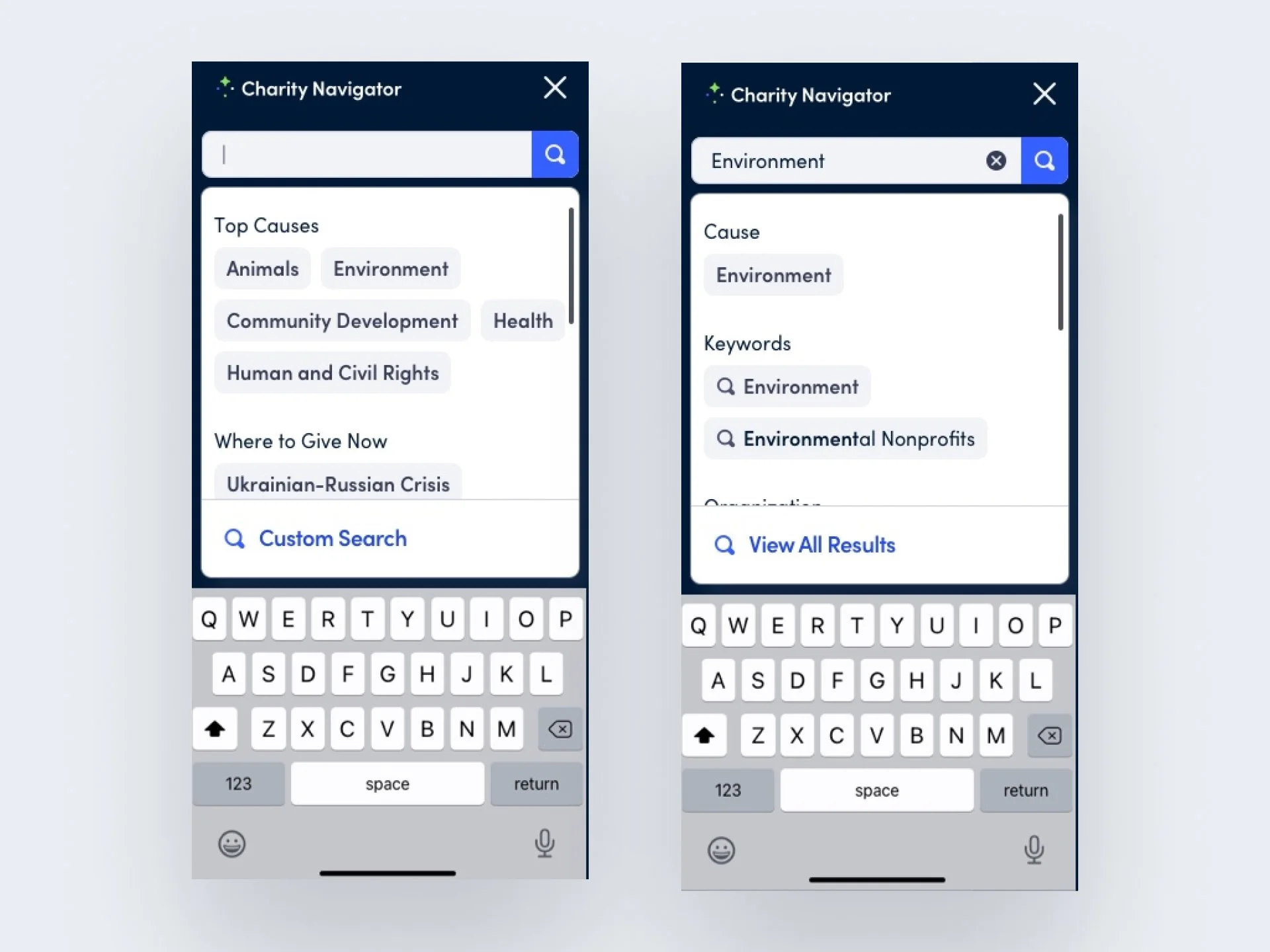
Screenshots of a mobile app called Charity Navigator showing search interface with keywords related to causes like Animals, Environment, Community Development, Health, and Human and Civil Rights. The interface has a search bar, a keyboard, and options to view results.
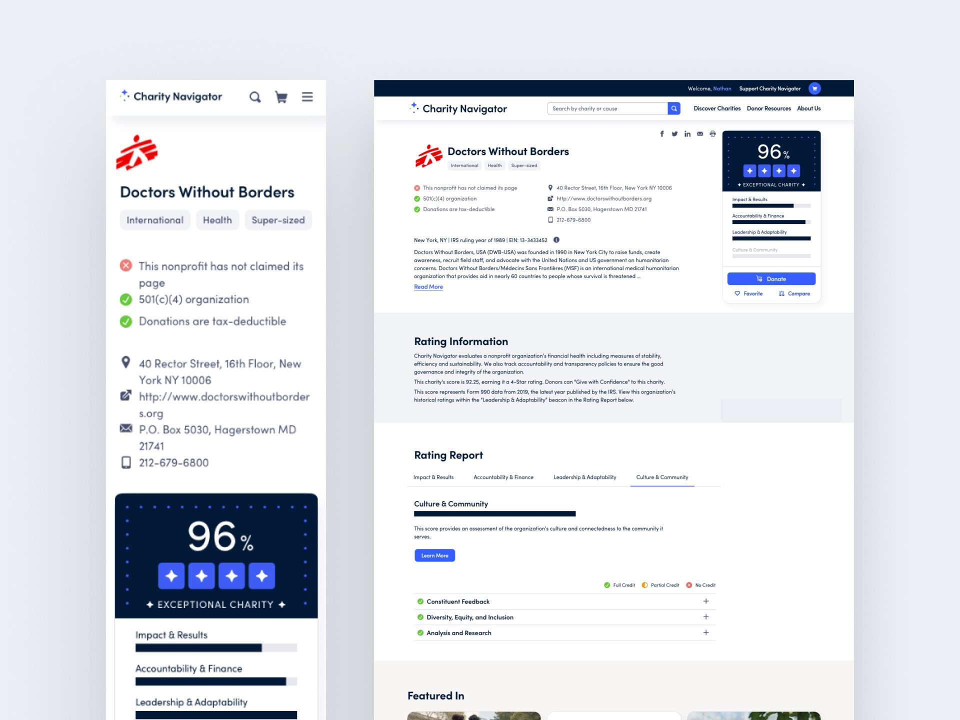
Screenshot of a charity organization webpage for Doctors Without Borders, showing the organization's logo, description, rating, and donation options.
Screenshot of a charity organization website homepage with navigation menu, search bar, content sections, images of people volunteering, fundraising stats, and footer with contact info and links.
Three pages of a digital style guide with color palettes, button styles, page conventions, and section headers in various shades of blue, green, gray, orange, and black.