Nationwide
OGILVY
ASSOCIATE DIRECTOR
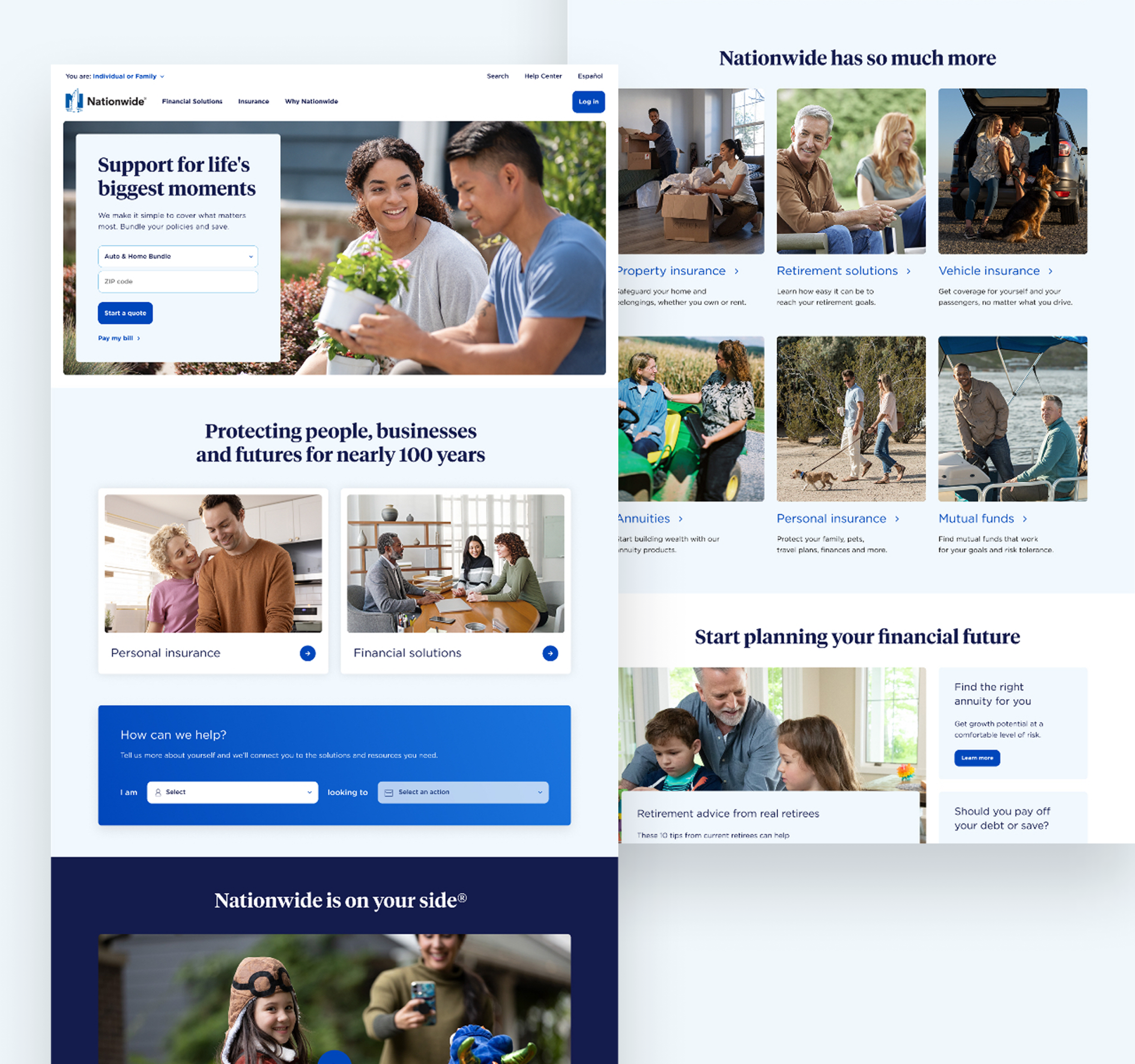
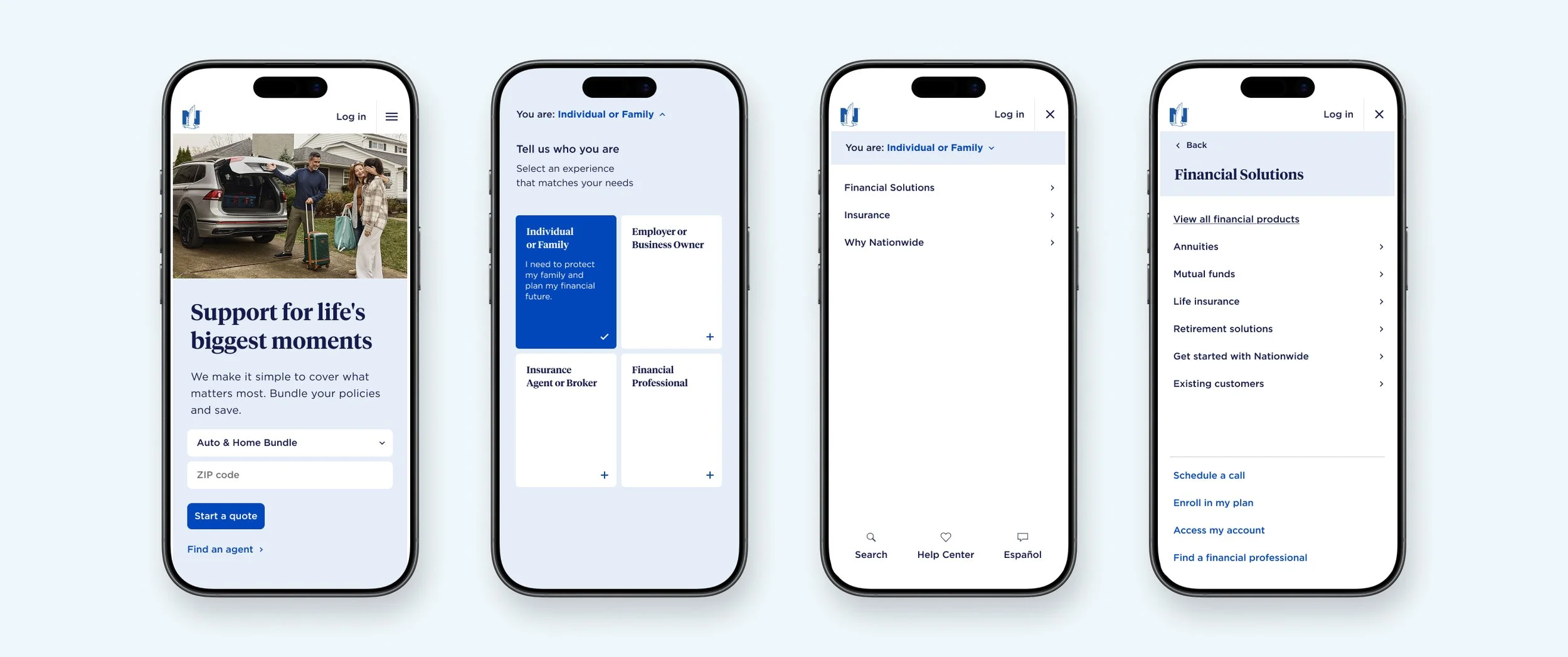
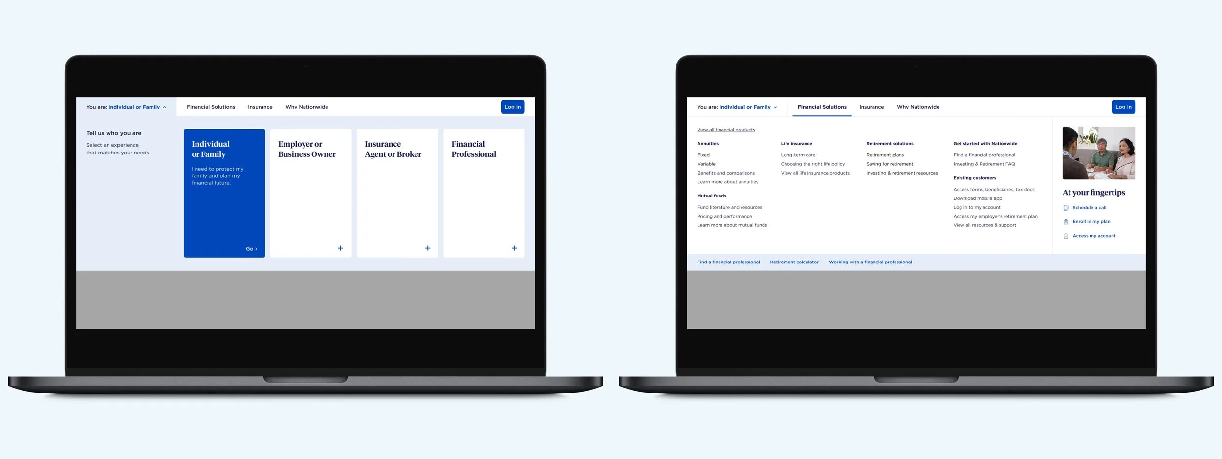
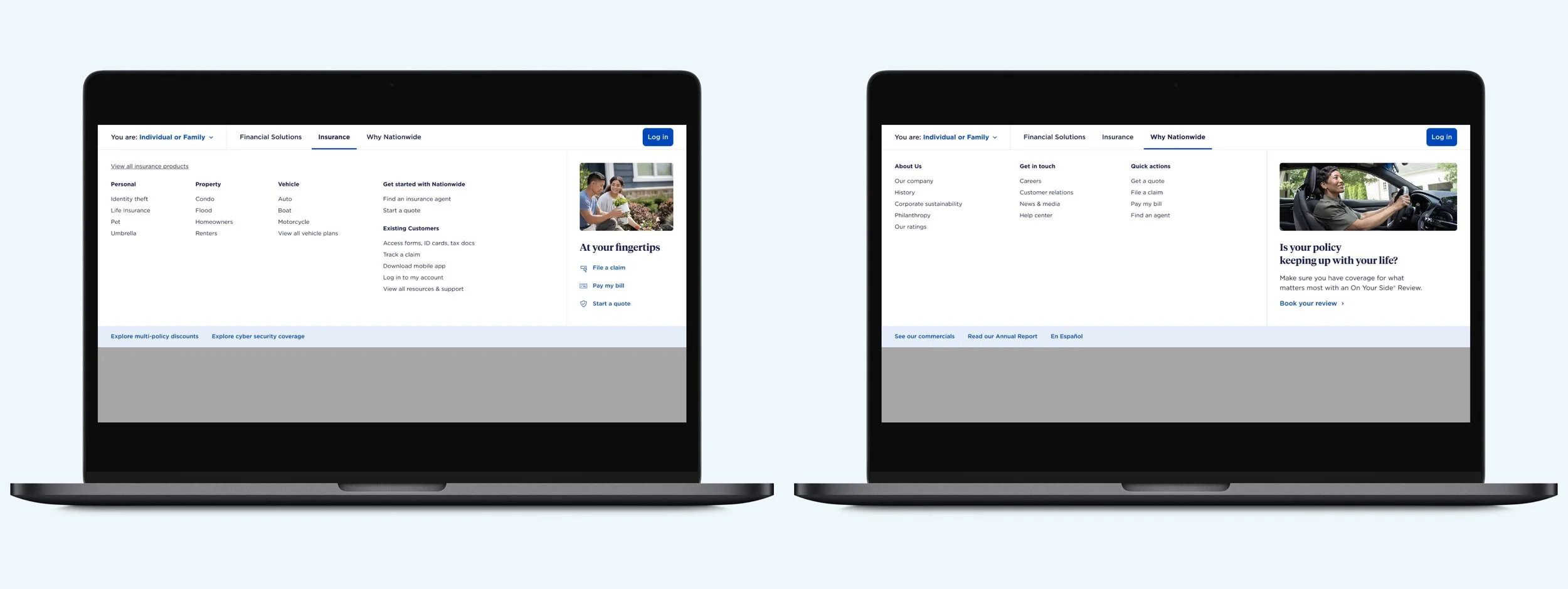
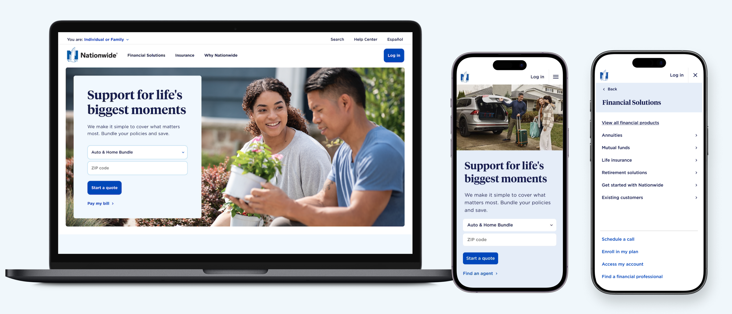
I served as design director on the Nationwide account from the pitch process through final delivery. Our challenge was to create a more intuitive navigation experience, and redesign the Nationwide site while staying within existing brand guidelines.
The Pitch
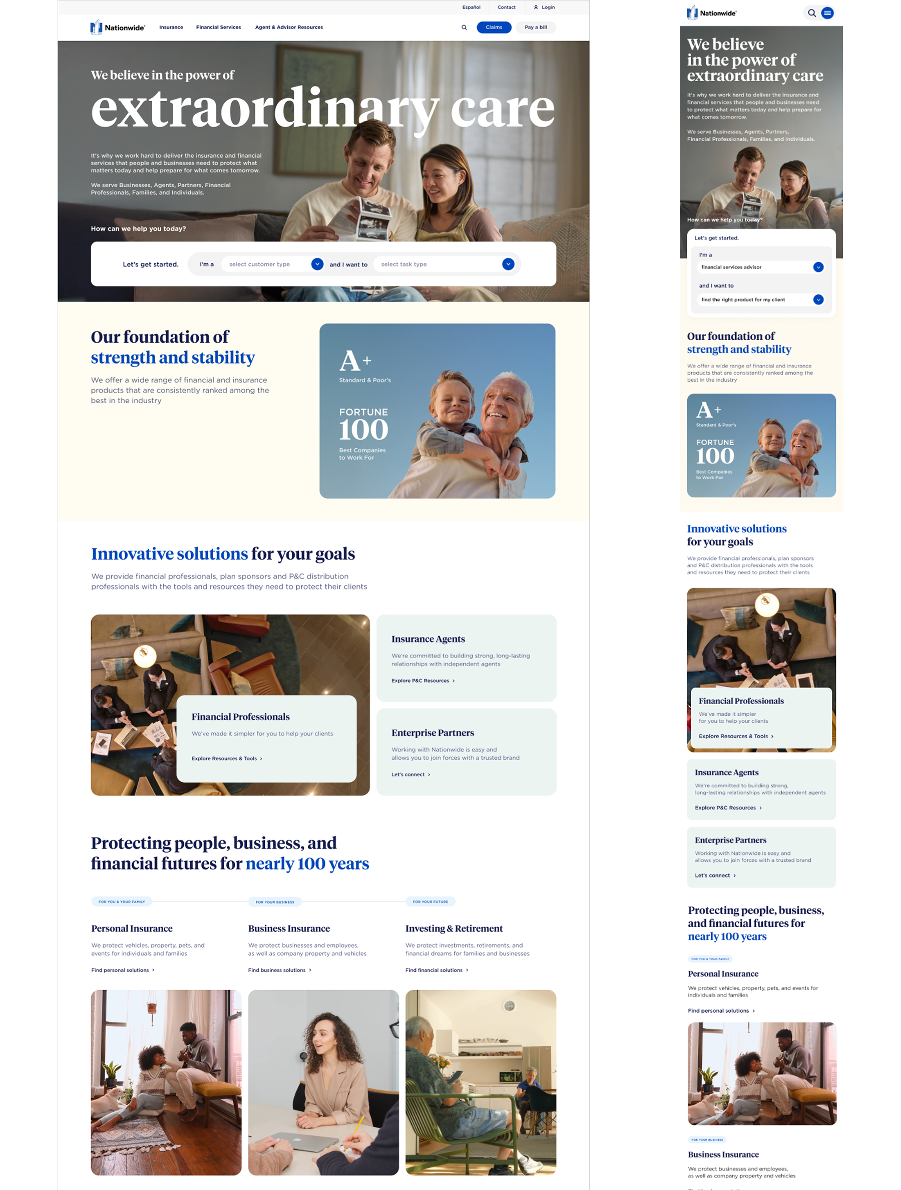
As Design Director for the Nationwide pitch, I led a small team through a fast-paced process to build a compelling case for their homepage redesign. That meant high-fidelity mockups and a clickable prototype delivered under a tight deadline. The design stayed true to Nationwide's brand guidelines while pushing toward a cleaner, more modern aesthetic. My role covered both the creative direction and managing the design team, keeping the work focused and the quality high throughout. We won the account.
The Process
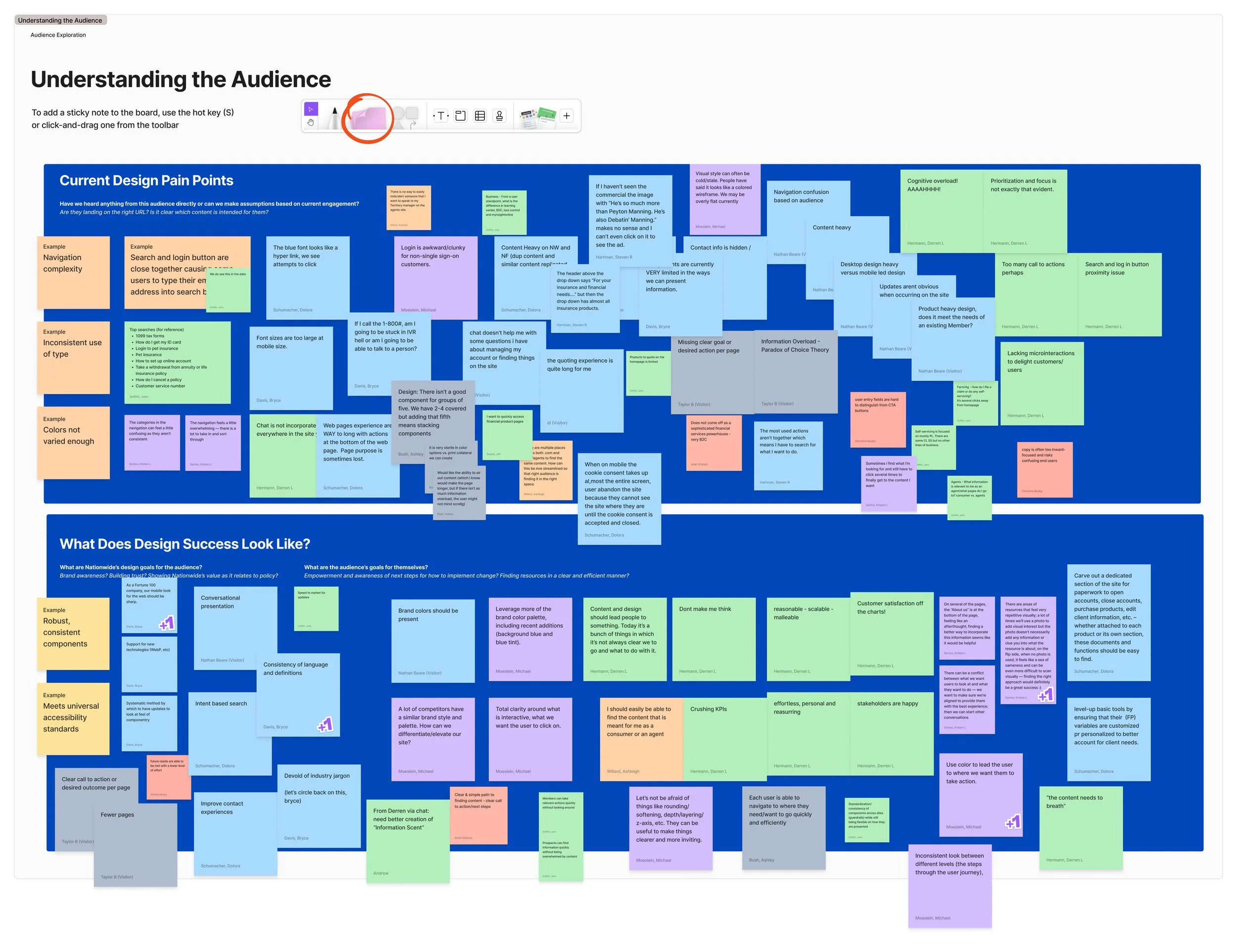
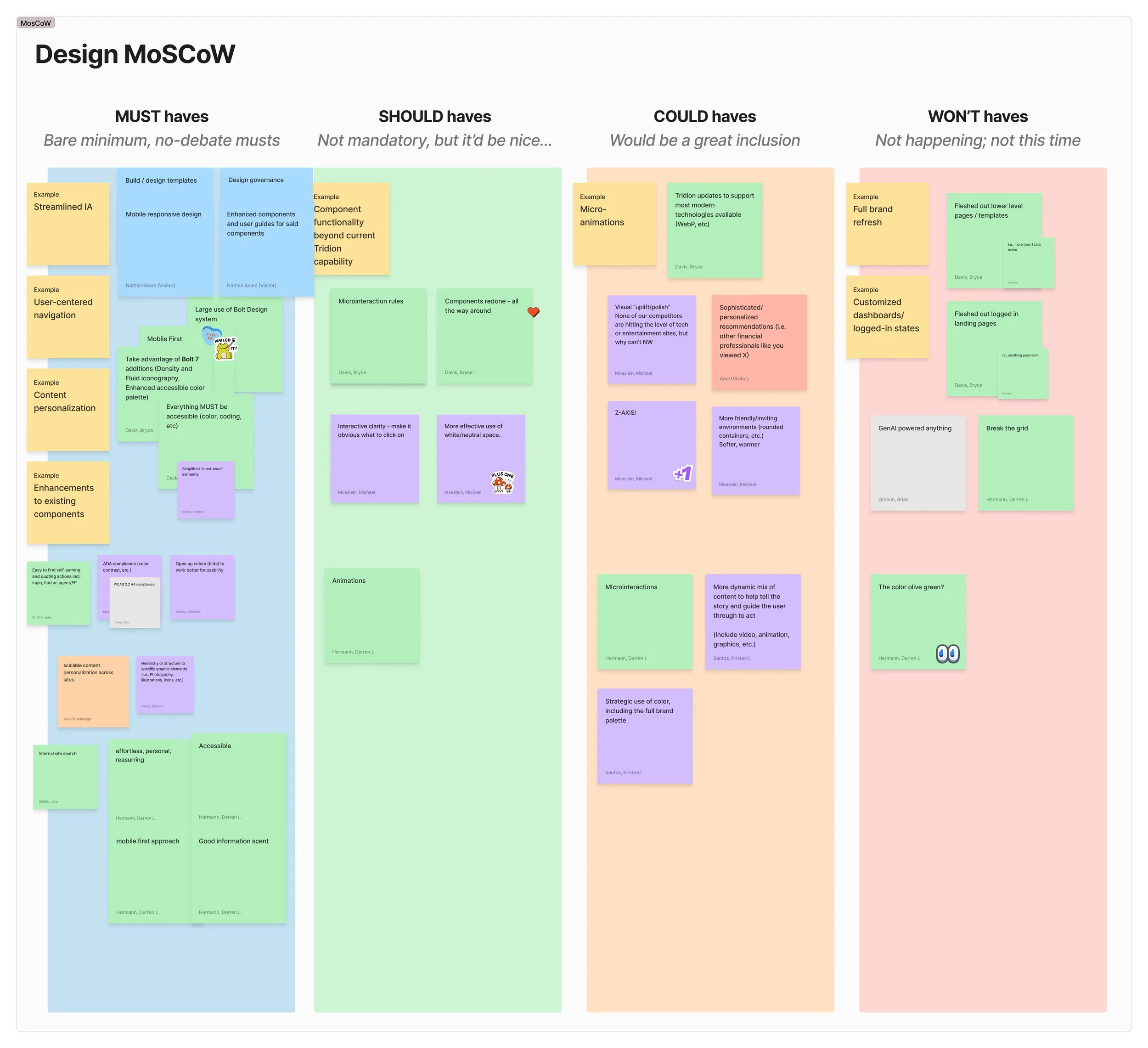
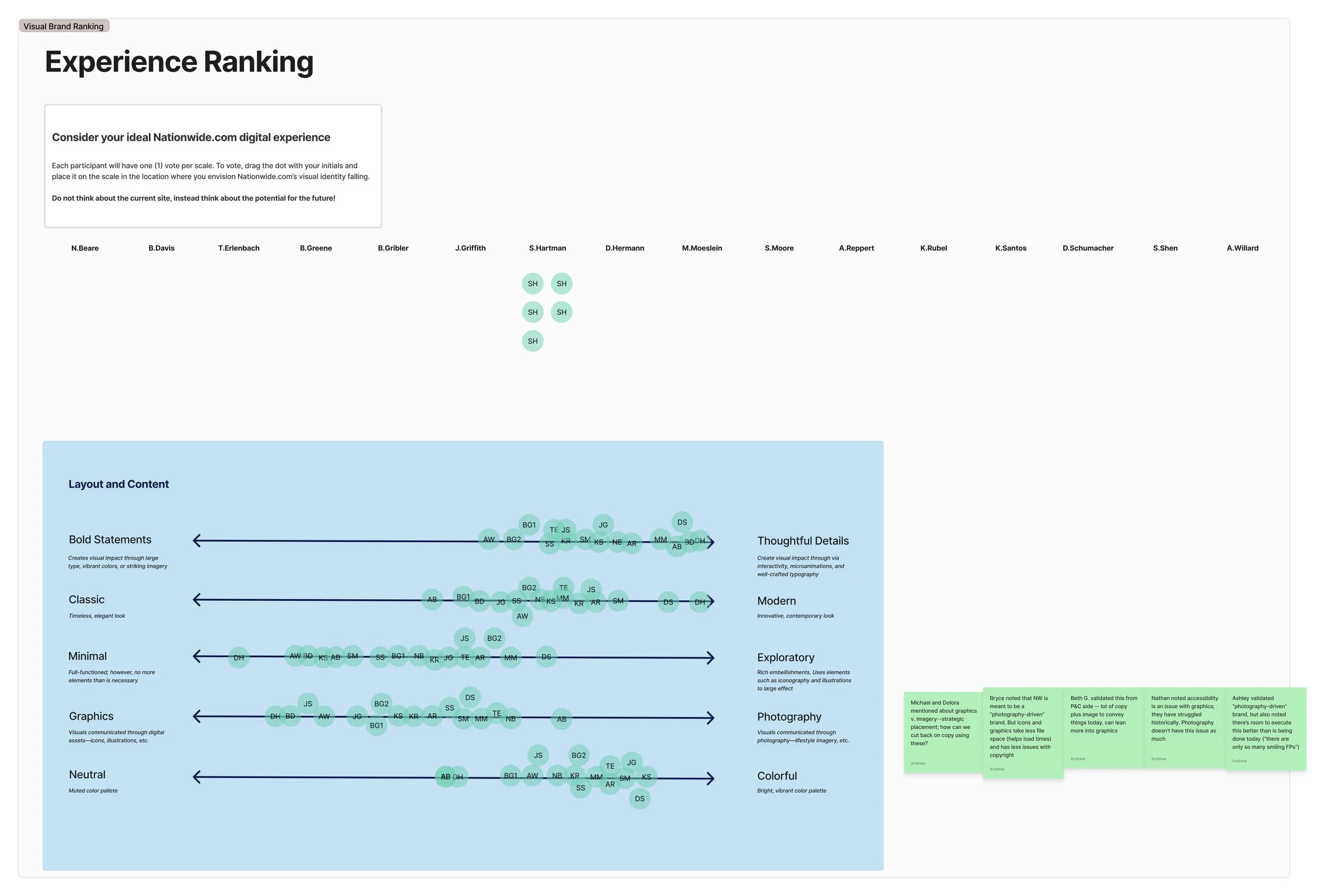
I led competitive and current state audits of Nationwide’s current website as well as the sites of their direct competitors. I facilitated a design workshop with key Nationwide stakeholders to surface existing pain points, align on goals, and establish constraints.
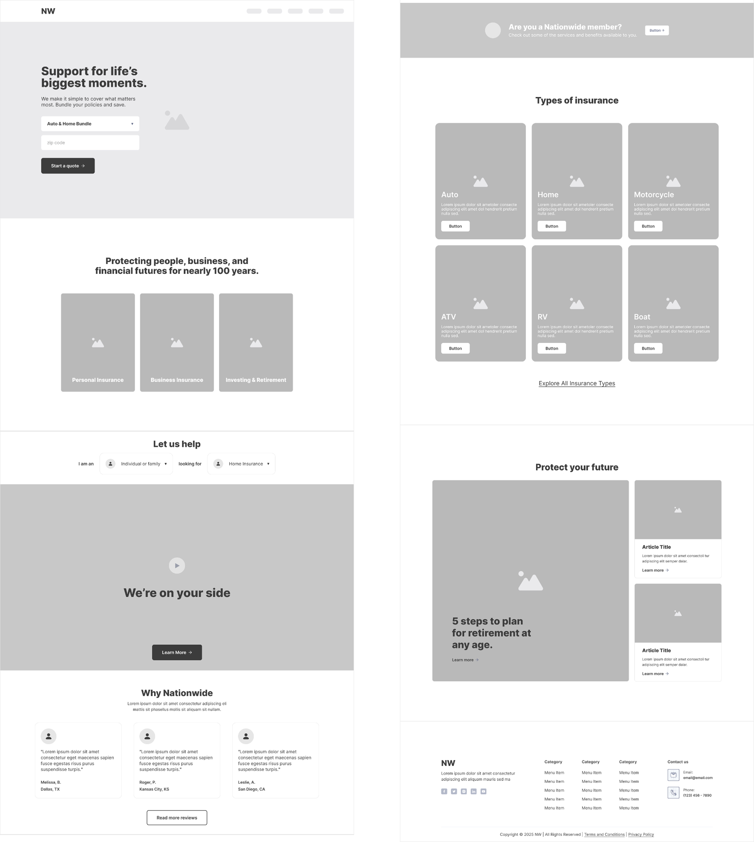
That foundation directly shaped the wireframes for the homepage and navigation. The wireframes allowed us to work through how to make the navigation more intuitive and the homepage layout more streamlined, while keeping the overall experience familiar to existing users. My team then developed style tiles to explore visual directions before moving into high fidelity designs.
The Result
The final deliverable was a comprehensive design system built to scale. This included high-fidelity designs for the homepage and navigation, a clickable prototype showcasing the new navigation in action, and a full component library designed to support a templated approach to the broader site redesign. Together, these assets gave Nationwide everything they needed to carry the redesign forward consistently across the site.